05 Redesigning the Search Experience
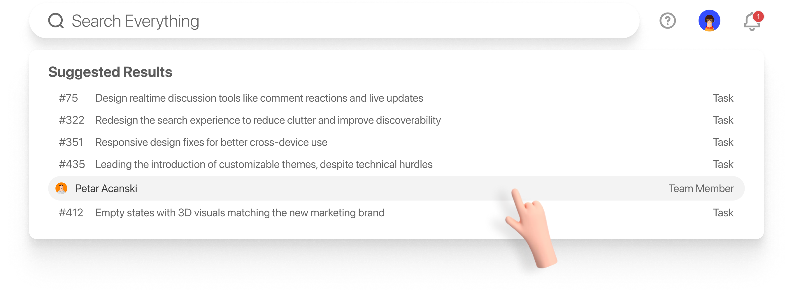
Problem: The search box was awkwardly placed near the logo and, when activated, overlapped it — creating visual clutter and confusing user interactions.
My Approach: Conducted a usability audit, mapped out user flows where search played a key role, and tested alternative placements (top-right, inline, modal search). Prioritized simplicity and discoverability.
Key Decision: Moved the search to a more intuitive location and designed a clean, focused input that didn’t compete visually with branding.
Impact: Improved search usability, reduced accidental misclicks, and created a more polished visual hierarchy. Positive feedback from beta users: ~65% reported the new search felt faster and easier to use.
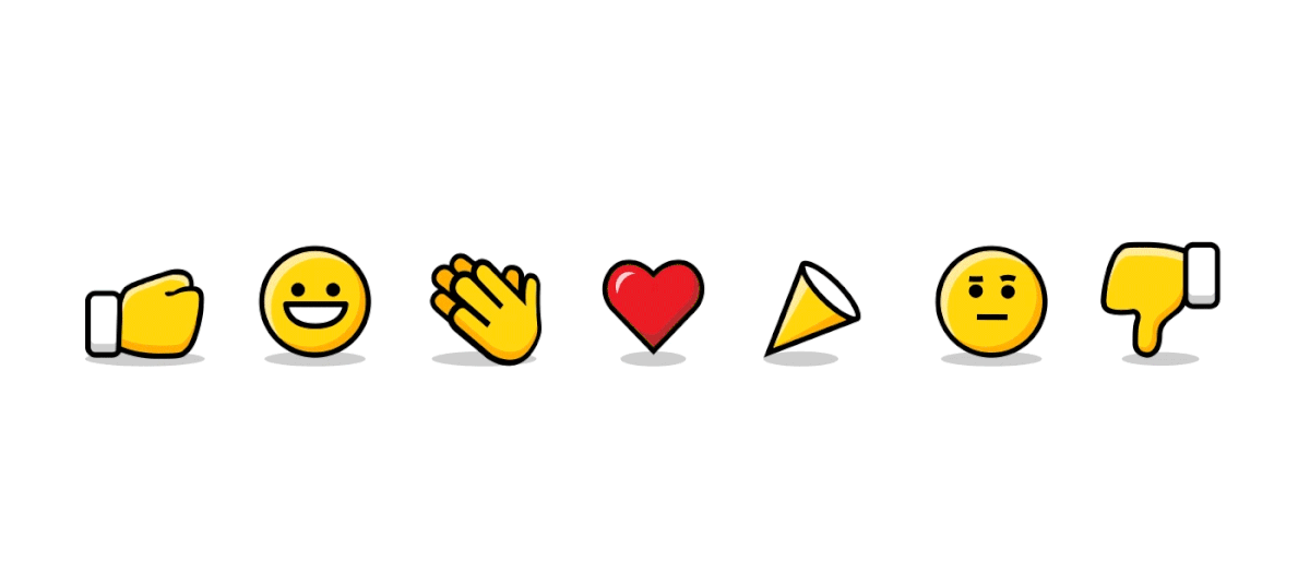
06 Designing Realtime Discussion Tools (Comment Reactions & Live Updates)
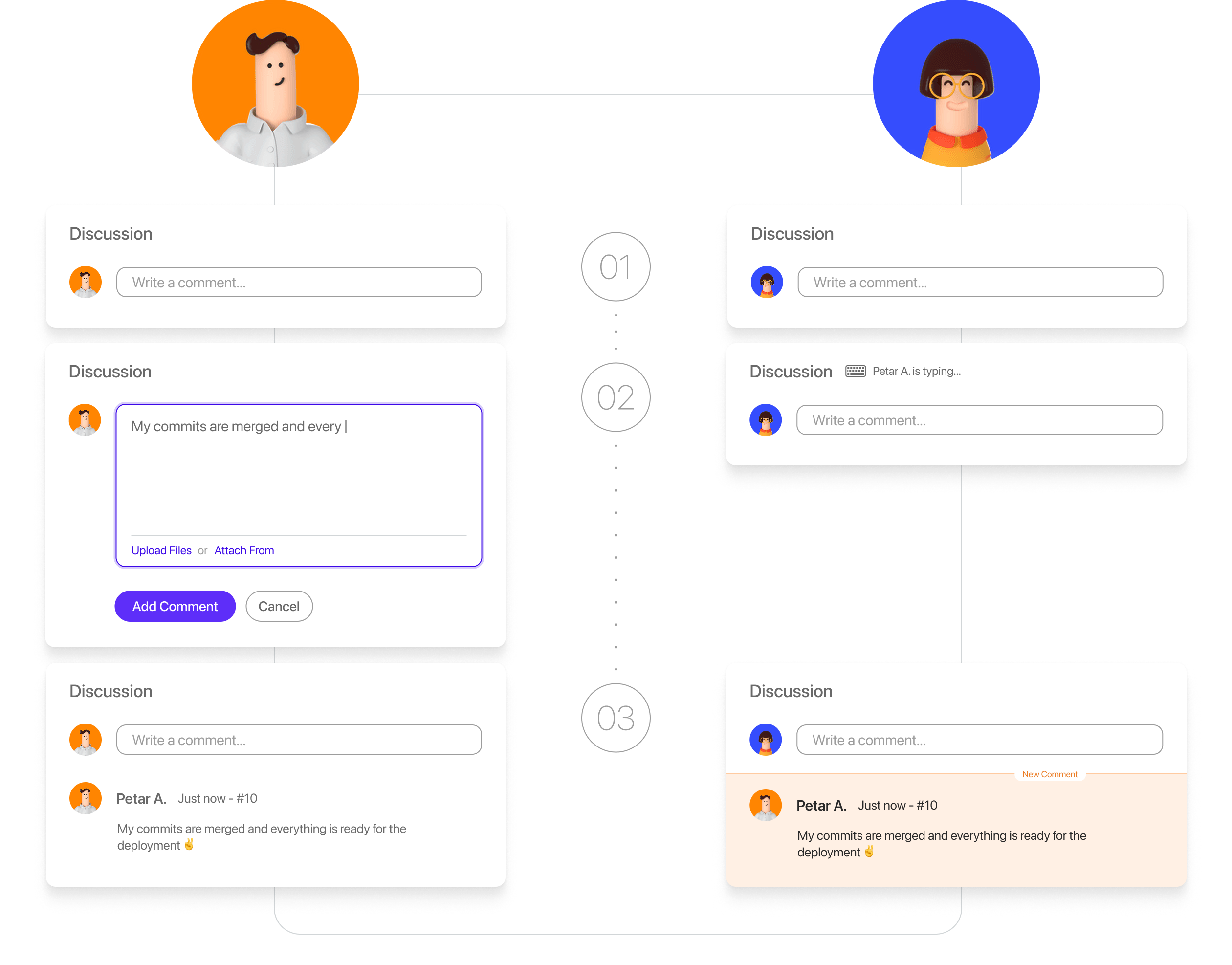
Problem: The app’s comment section lacked modern collaboration tools, leading to clunky communication and forcing users to refresh to see updates.
My Approach: Researched realtime patterns from tools like Slack and Trello; wireframed lightweight interaction designs like emoji reactions and live update indicators; collaborated with developers on feasibility.
Key Decision: Balanced adding modern features without overwhelming the simple UI — reactions and live updates were designed to feel additive, not intrusive.
Impact: Enhanced team collaboration, increased engagement in discussions, and reduced refresh frustration.
07 Implementing Responsive Design Fixes
Problem: Many pages had stacked elements that didn’t adapt well to various screen sizes, hurting the mobile and tablet experience.
My Approach: Conducted a full responsive audit, identifying layout breakpoints and problem areas; worked closely with developers to prototype and test solutions on key screen sizes.
Key Decision: Prioritized the most high-traffic templates and fixed their responsiveness first to maximize impact without overhauling the entire app at once.
Impact: Significantly improved usability on mobile and tablet devices, expanding accessibility for on-the-go users.
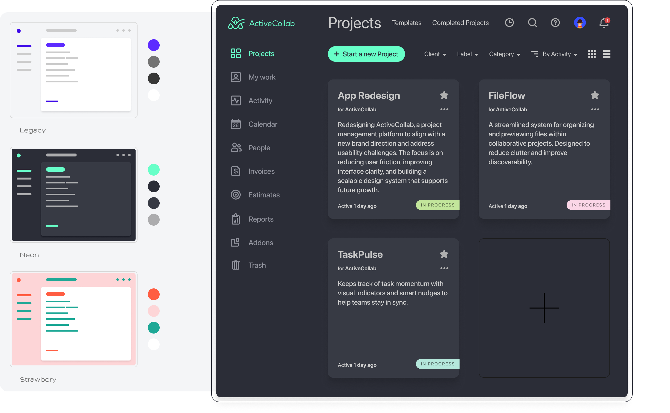
08 Designing Customizable Themes
Problem: The app architecture wasn’t originally designed to support user-selectable themes, but offering personalization was a high-requested feature.
My Approach: Mapped out the technical limitations with the dev team; identified which components needed refactoring to enable theming; created theme prototypes (light/dark, color variations) and tested them with users.
Key Decision: Built a scalable theming system, focusing on colors and backgrounds first before expanding to more complex elements.
Impact: Gave users more control over their environment, increasing user satisfaction and aligning the product with modern customization expectations.
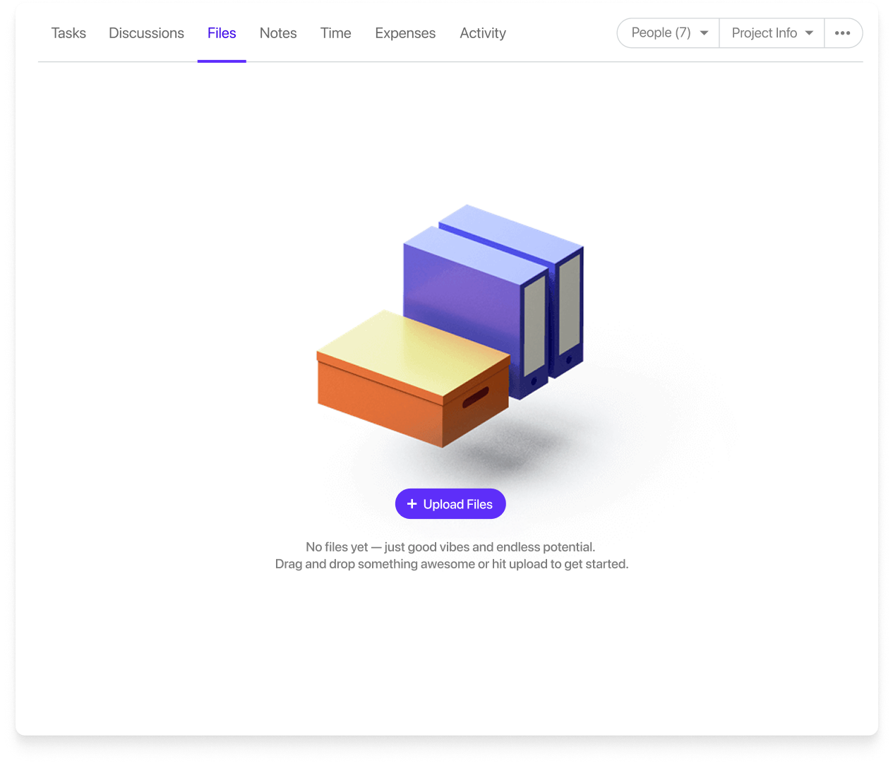
09 Refreshing Empty States with 3D Visuals
Problem: Many pages had stacked elements that didn’t adapt well to various screen sizes, hurting the mobile and tablet experience.
My Approach: Conducted a full responsive audit, identifying layout breakpoints and problem areas; worked closely with developers to prototype and test solutions on key screen sizes.
Key Decision: Prioritized the most high-traffic templates and fixed their responsiveness first to maximize impact without overhauling the entire app at once.
Impact: Significantly improved usability on mobile and tablet devices, expanding accessibility for on-the-go users.
10 Impact
- Improved user satisfaction with search, collaboration, and personalization.
- Positive feedback from beta users: ~65% reported the new search felt faster and easier to use. Post-launch survey showed a +20% improvement in satisfaction scores for the collaboration features.
- Enhanced visual cohesion between product and brand presence.
- Users described the updated interface as ‘more polished’ and ‘modern’ in qualitative feedback sessions.
- Increased engagement with new features like realtime reactions.
- Realtime comment reactions saw a 35% adoption rate within the first two weeks, indicating strong initial user interest. Average comment thread length increased by ~15%, showing higher team engagement after introducing live updates. User activity logs showed a ~25% rise in daily active interactions on collaborative tasks after feature rollout.
11Reflection
This experience deepened my skill in balancing UX ambition with technical reality — and reinforced the value of focusing on small, meaningful details that improve everyday user experience.